Purdue Experience Studio x Froglsayer
Kiosk design guidelines for hospitality venues
ROLE
Design Researcher
Lead - Usability Testing
COLLABORATORS
(5 researchers and designers)
Chanseo, Kathleen, Nina, Raelee & Ryan
PROBLEM
Kiosks are everywhere, good kiosk experiences aren't…
Frogslayer↗︎ builds kiosk software for food and entertainment venues, including large arcade chains. Their research showed 66% of users prefer self-service. But, widespread adoption had exposed a gap: there were no substantive standards for what a good kiosk experience should be. They asked us to build them.
FIELD RESEARCH
…So we went to see for ourselves
→ Users staring at on-screen text while the card reader below them flashed unnoticed.
→ Countdown timers (likely meant for queue management) creating anxiety.
→ And, loyalty pop-ups causing confusion and hesitation every single time.
SCOPING
What we observed gave us a lot to work with, so we narrowed it down
Across multiple venue visits, three recurring themes emerged from our field notes, which we proposed to Frogslayer as the focus areas for guidelines:
Interface Design
Marketing & Loyalty Integration
Behavioral & Environmental Factors
EXPLORATION
Three focus areas, tons of potential ideas
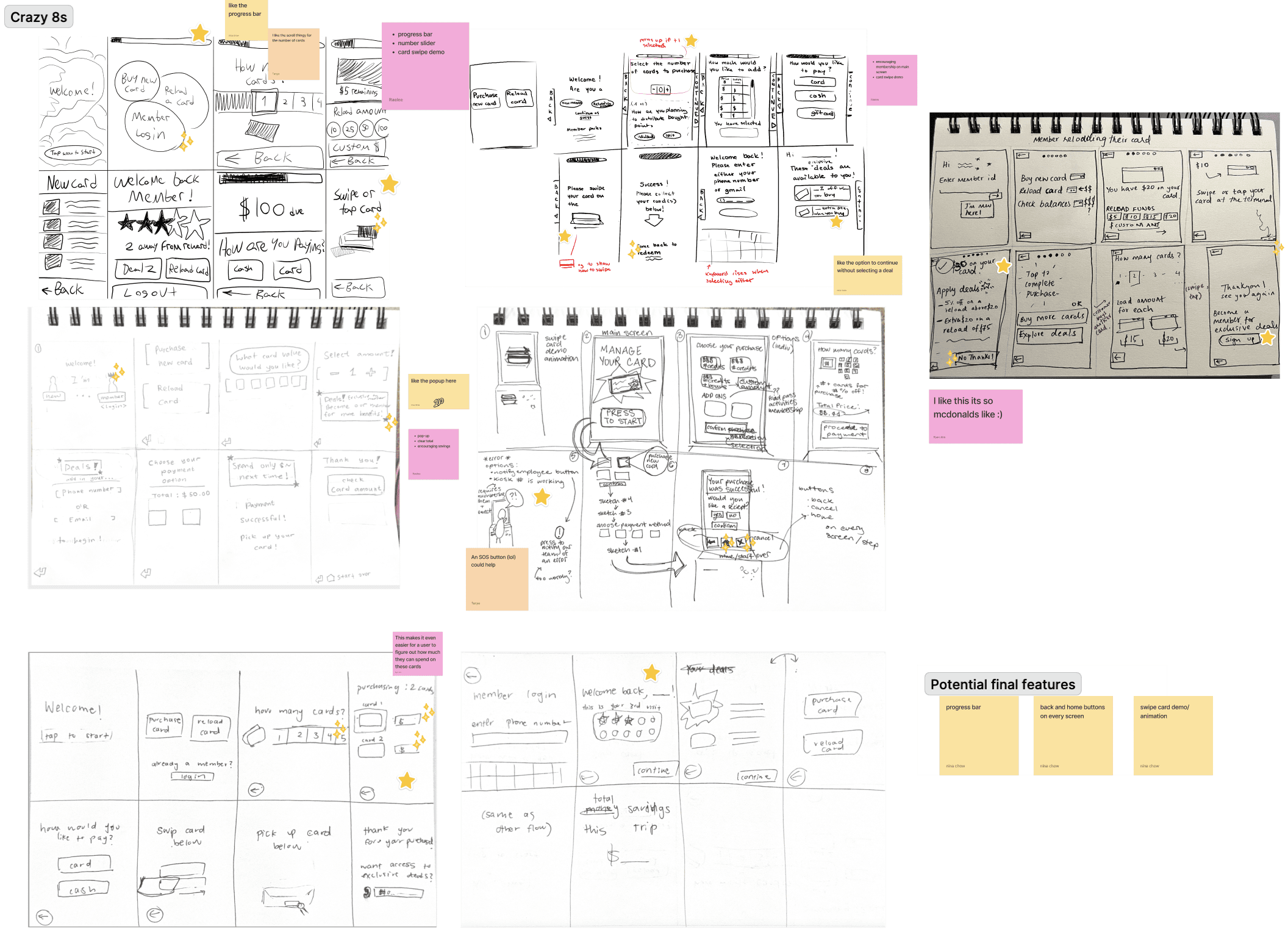
With requirements scoped, we ran Crazy 8s to quickly generate ideas across each theme.
→ Interface design prompted explorations into visual hierarchy, feedback states, and attention-directing across a large public display.
→ Marketing & loyalty integration raised questions about timing, tone, and whether sign-up flows belonged in the transaction at all.
→ Behavioral & environmental factors pushed us to think beyond the screen, considering queue anxiety, ambient noise, etc.
WORK
Four creative ideas - distilled, not diluted
The e-book translated four student-pitched innovations that covered sustainability, metaverse experiences, check-in tech, and AI housekeeping into engaging narratives that balanced creative excitement with industry credibility.
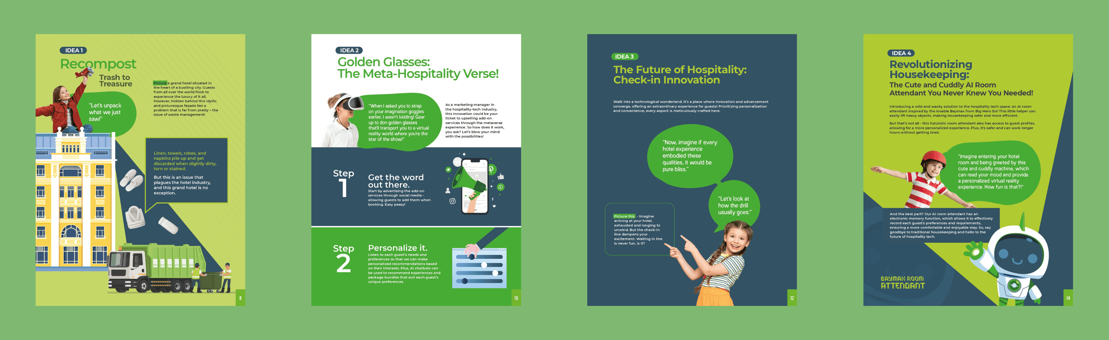
Design note: The visual language is intentional and rooted in the client's brand guidelines, which positioned them around futuristic hospitality-tech.
OUTCOME
A thought leadership asset that earned its place
The final asset positioned the client as more than a tech vendor, but as an organization that invested in imagination and wonder, helping to fuel the next generation of ideas about where hospitality can, and will evolve.
TAKEAWAYS
Clarity is kindness
My north star throughout was the students who came up with these ideas. My job was to represent them as clearly and compellingly as possible — a motto I've consciously carried with me since.
Constraints aren't always limiting
Within the brand guidelines we were given, we still found room to experiment. We presented several versions to the client, and they chose the most experimental one. This experience taught me to always put a range on the table early. You never know what'll click.