Purdue Experience Studio x Frogslayer
Kiosk design guidelines for hospitality venues
ROLE
UX Designer
Lead - Usability Testing
COLLABORATORS
(5 researchers and designers)
Chanseo, Kathleen, Nina, Raelee & Ryan
PROBLEM
Kiosks are everywhere, good kiosk experiences aren't…
Frogslayer↗︎ builds kiosk software for food and entertainment venues, including large arcade chains. Their research showed 66% of users prefer self-service. But, widespread adoption had exposed a gap that there were no substantive standards for what a good kiosk experience should be.
FIELD RESEARCH
…So we went to see for ourselves
→ Users staring at on-screen text while the card reader below them flashed unnoticed.
→ Countdown timers (likely meant for queue management) creating anxiety.
→ And, loyalty pop-ups causing confusion and hesitation every single time.
SCOPING
What we observed gave us a lot to work with, so we narrowed it down
Across multiple venue visits, three recurring themes emerged from our field notes, which we proposed to Frogslayer as the focus areas for guidelines.
EXPLORATION
Three focus areas, tons of potential ideas
With requirements scoped, we ran Crazy 8s to quickly generate ideas across each theme.
→ Interface design prompted explorations into visual hierarchy, feedback states, and attention-directing across a large public display.
→ Marketing & loyalty integration raised questions about timing, tone, and whether sign-up flows belonged in the transaction at all.
→ Behavioral & environmental factors pushed us to think beyond the screen, considering queue anxiety, ambient noise, etc.

THE APPROACH
We built custom prototypes to test on full-size kiosk monitors, set in context
Prototypes weren't part of the brief; we proposed them. Building from scratch gave us the flexibility to tweak at a granular level as we went, unconstrained by an existing product.


Design note: Above, is an an early iteration. Custom components, arcade-inspired aesthetics, layouts built for kiosk scale — each screen built around a hypothesis drawn from our field observations.
We treated the prototypes as a research tool, not an end product. Here's the approach we mapped out:

TESTING
20+ participants, 3 rounds, and a loyalty adoption problem we couldn't ignore
We ran sessions on a full-size monitor in Purdue's student center (busy, crowded, surrounded by eateries) as a deliberate stand-in for a hospitality venue. Each participant was tasked with purchasing and loading a game card.


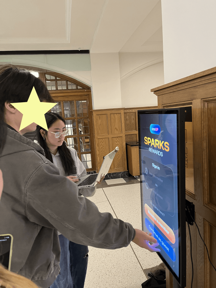
Simpler UI changes were iterated in real time; larger structural changes held for the next round. Loyalty integrations (the most anxiety-inducing part of the flow) earned their own dedicated A/B rounds.
OUTCOME
7 guidelines handed off, with a measurable difference
7 rigorously tested guidelines, a full Figma handoff, and a presentation to Frogslayer's stakeholders. Based on observed improvements in task completion time, Frogslayer estimated a 28% reduction in queue times against prior deployment baselines.
Final presentation:
REFLECTIONS
A gateway into service design and beyond
Getting to test on a full-size kiosk monitor was so fun and added a ton of value to our outcomes. I fell down fascinating rabbit holes in Service Design and CX, and came to appreciate just how many variables go into defining success for an experience like this.
Prototypes as research tools
Some of our best research questions only emerged once we started building. Testing the loyalty flows surfaced problems that no interview about kiosk usage would have caught.
On the team… <3
I had a wonderful team. I learned a lot from them, and found moments to offer mentorship where I could; which meant just as much to me as the work itself.